Analyzing Maps/Graphs/Charts
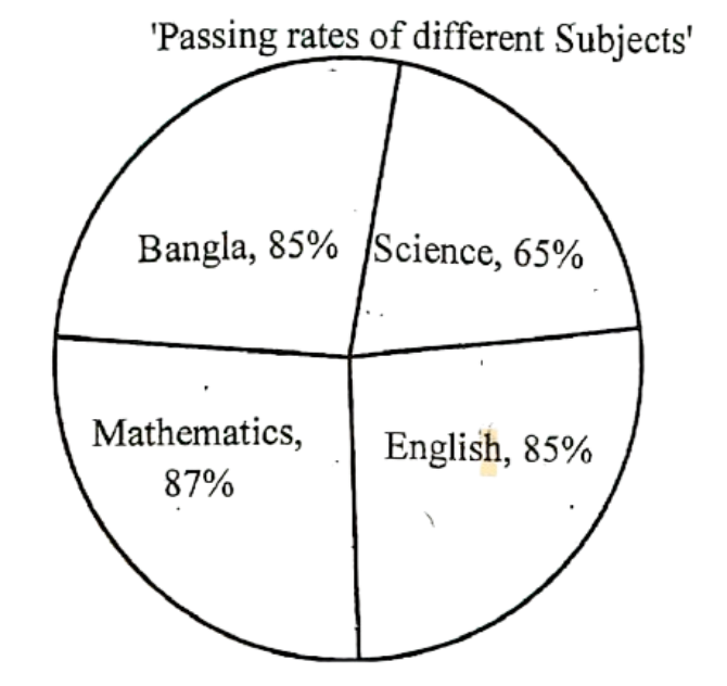
1. Look at the following pie-chart. It represents the passing rates of the students in different subjects of a school. Now, describe the chart in your own words.

Ai এর মাধ্যমে

১০ লক্ষ+ প্রশ্ন ডাটাবেজ

প্র্যাকটিস এর মাধ্যমে নিজেকে তৈরি করে ফেলো
উত্তর দিবে তোমার বই থেকে ও তোমার মত করে।

সারা দেশের শিক্ষার্থীদের মধ্যে নিজের অবস্থান যাচাই
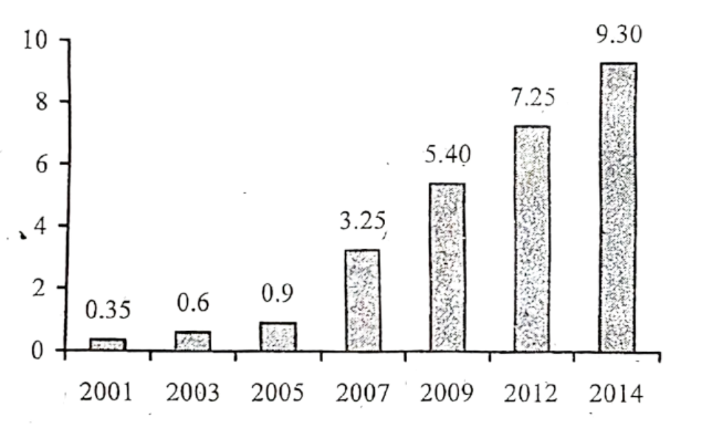
The graph below shows "The Number of Telephione and Mobile Users" from 2001 to 2014. Describe the graph in 150 words. You should highlight and summarize the information given in the graph.
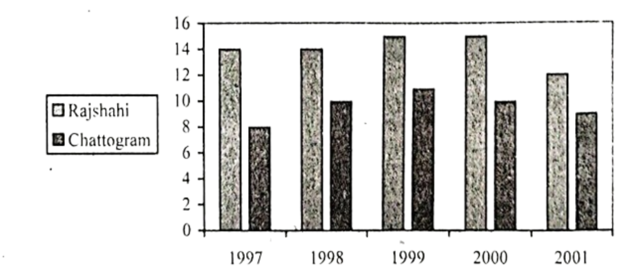
The chart below shows the minimum temperature (in Celsius) at Chattogram and Rajshahi in the years between 1997 and 2001. Describe the chart in 150 words. You should highlight and summarize the information given in the chart.
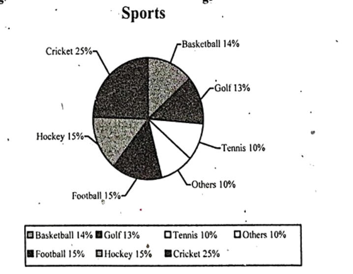
Look at the following pie chart. It shows the people's interest in sport activities. Describe the chart in 150 words. You should highlight and summarize the information given in the chart.
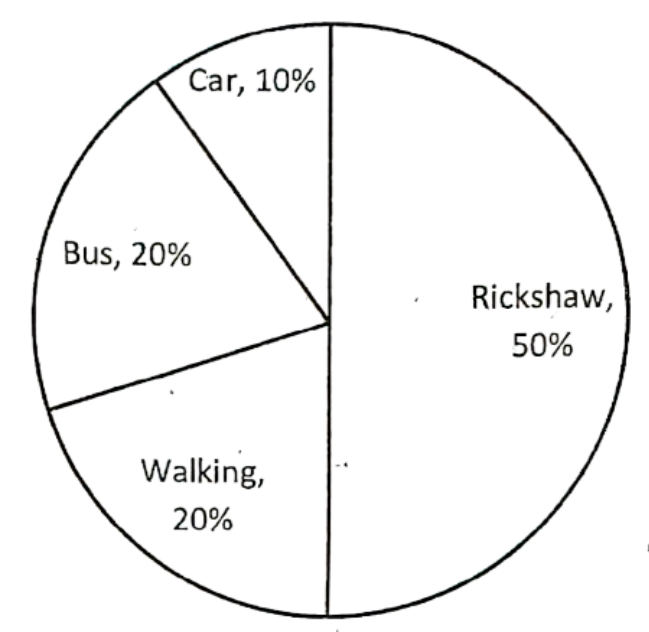
The pie chart below shows the percentage of transportation used by the students to come to their school. Describe the chart in 150 words. You should highlight and summarize the information given in the chart.