11. Analyzing maps / graphs / charts
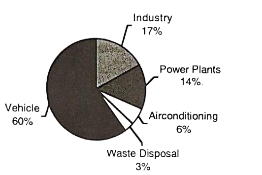
The chart below shows the sources of air pollution in a city. Now, analyse the chart focusing on the main aspects. (At least in 100 words)

The sources of air pollution in a city (%)
The given pie chart shows us the percentages of the sources of air pollution in a particular city. Here, five prominent elements are presented in the graph.
As per the available pieces of information in the chart, we notice that the use of vehicle holds the lion's share of the sources of air pollution. It is alarming that only vehicle holds 60%. Next comes the turn of industry, which holds 17%. Power plants, airconditioning, and lastly waste disposal provide 14%, 6% and 3% respectively.
The number of vehicles is increasing day by day. As a result, dust, smoke, etc. are alarmingly increasing. If the situation does not change, our lives will be simply impossible in cities. Industries are also increasing in and around cities. To lead a healthy life, industrial parks need to be created and all industries be shifted there. Secondly, the number of industries must also be reduced. Finally, smoke emission must be controlled.
Ai এর মাধ্যমে
১০ লক্ষ+ প্রশ্ন ডাটাবেজ
প্র্যাকটিস এর মাধ্যমে নিজেকে তৈরি করে ফেলো
উত্তর দিবে তোমার বই থেকে ও তোমার মত করে।
সারা দেশের শিক্ষার্থীদের মধ্যে নিজের অবস্থান যাচাই
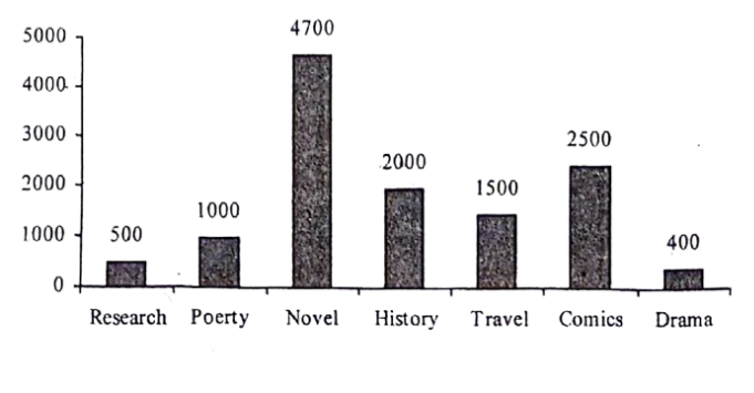
The graph below shows the importance and usage of English. Describe the graph in at least 80 words:
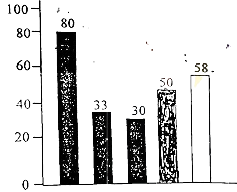
(By serial)
Usage of English in information technology 80%
Usage of English as the 1st language 33%
Used in various organizations 30%
Used in other purposes 50%
Using English as the 2nd language 58%
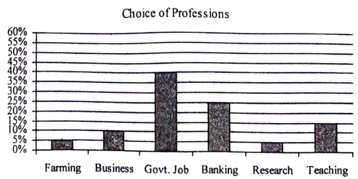
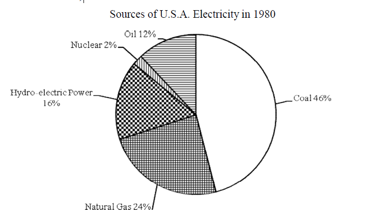
Look at the chart. It shows the sources of U.S.A. electricity in 1980. Now, analyze the chart focusing the main
aspects (At least in 150 words)

The graph below shows the positive and negative Uses of Internet according to different age groups of the users. Describe the chart at least in 150 words. You should highlight the information and report the main features given in the chart.

Look at the chart. It shows COVID-19 Pandamic cases and deaths by 5 countries on 15 June, 2022. Describe the chart focusing the important aspects and analyse the result in 80 words.
Country | Total Cases | Total Deaths |
|---|---|---|
United States | 857,58,638 | 10,11,925 |
Brazil | 315,41,479 | 6,68,354 |
India | 432,45,517 | 5,24,792 |
United Kingdom | 224,99,617 | 1,79,539 |
Bangladesh | 19,54,405 | 29,131 |