11. Analyzing maps / graphs / charts
The chart shows the sources of air pollution in Dhaka, Bangladesh. Describe the chart within 100 words highlighting the information given in the chart.
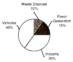
The sources of air pollution in Dhaka
The given pie chart shows us the percentages of the sources of air pollution in Dhaka. Here, four prominent (লক্ষণীয়) sources are presented in the 'graph.'
As per the available pieces of information in the chart, we notice that the use of vehicles holds the lion's share of the sources of air pollution. It is alarming that vehicles alone hold . Next comes the turn of industry, which holds . Power plants are responsible for causing of the air pollution, and lastly, waste disposal contributes .
If the situation does not change, our lives in Dhaka will be at stake (বিপদাপন্ন). To lead a healthy life, industries have to be shifted to the regions far away from human habitation. Finally, smoke emission must be controlled.
Ai এর মাধ্যমে
১০ লক্ষ+ প্রশ্ন ডাটাবেজ
প্র্যাকটিস এর মাধ্যমে নিজেকে তৈরি করে ফেলো
উত্তর দিবে তোমার বই থেকে ও তোমার মত করে।
সারা দেশের শিক্ষার্থীদের মধ্যে নিজের অবস্থান যাচাই
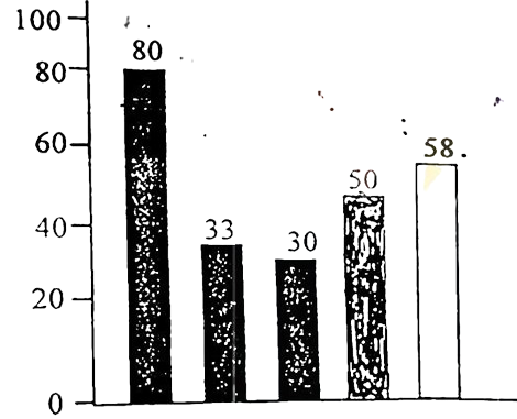
The graph below shows the importance and usage of English. Describe the graph in at least 80 words:
 (By serial)
Usage of English in information technology 80%
Usage of English as the 1st language 33%
Used in various organizations 30%
Used in other purposes 50%
Using English as the 2nd language 58%
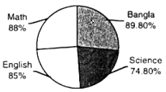
The pie chart shows the passing rates of different subjects of a school. Now, write a paragraph analyzing/describing the chart and give a suitable title to it.
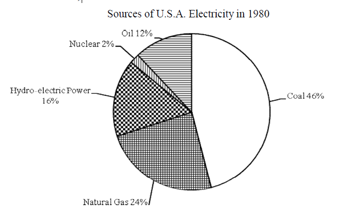
Look at the chart. It shows the sources of U.S.A. electricity in 1980. Now, analyze the chart focusing the main
aspects (At least in 150 words)
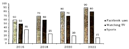
The graph below shows what percentage of time the college students in different areas of our country spend for pastime activities from 2016 to 2022 . Describe the graph in 150 words.