Analyzing Maps/Graphs/Charts
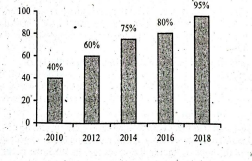
1. The graph below shows the number of people using mobile phone from the year 2010 to 2018. Describe the graph in 150 words. You should summarize the information given in the following graph.
Ai এর মাধ্যমে
১০ লক্ষ+ প্রশ্ন ডাটাবেজ
প্র্যাকটিস এর মাধ্যমে নিজেকে তৈরি করে ফেলো
উত্তর দিবে তোমার বই থেকে ও তোমার মত করে।
সারা দেশের শিক্ষার্থীদের মধ্যে নিজের অবস্থান যাচাই
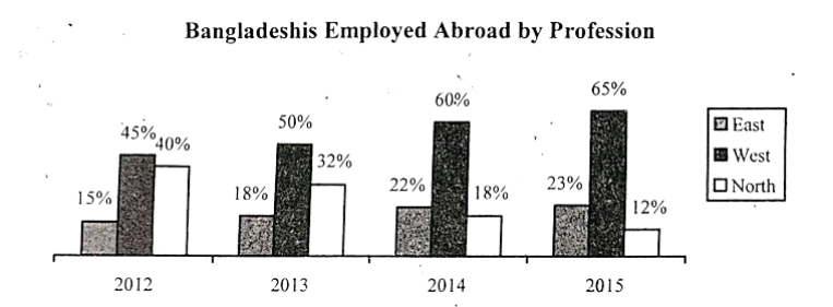
The graph below shows the number of the Bangladeshis employed abroad by profession. Describe the graph in 150 words. You should effectively highlight the information given in the graph.
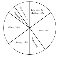
Look at the chart. It shows the distribution of percentages of a family's income into different categories. Now; analyze the chart in 150 words focusing the main aspects.
The distribution of the percentages of a family's income into different categories (%)
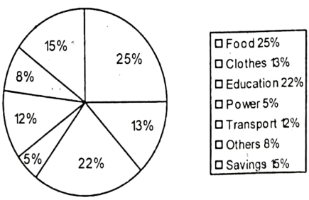
The pie chart gives the expenditure (in percentage) on various items and savings of a family during a month. The monthly savings of the family is tk 5000.
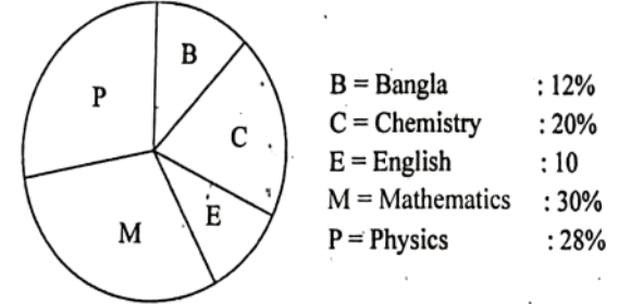
Look at the pie chart below. It shows the fondness of the students in different subjects. Now, describe it.