Analyzing Maps/Graphs/Charts
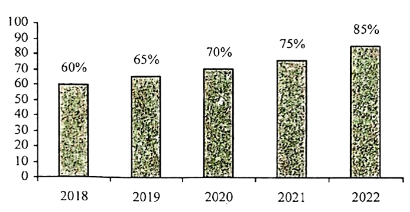
1. The graph below shows the poverty reduction rate of Bangladesh from 2018 to 2022. Describe the graph in 150 words. You should highlight and summarize the information given in the graph.
Ai এর মাধ্যমে
১০ লক্ষ+ প্রশ্ন ডাটাবেজ
প্র্যাকটিস এর মাধ্যমে নিজেকে তৈরি করে ফেলো
উত্তর দিবে তোমার বই থেকে ও তোমার মত করে।
সারা দেশের শিক্ষার্থীদের মধ্যে নিজের অবস্থান যাচাই
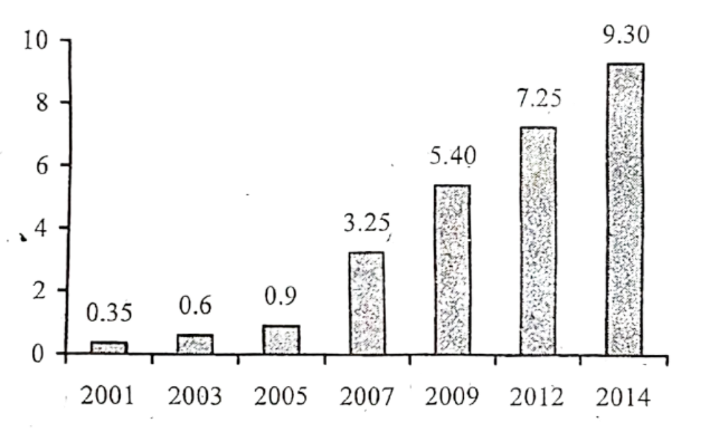
The graph below shows "The Number of Telephione and Mobile Users" from 2001 to 2014. Describe the graph in 150 words. You should highlight and summarize the information given in the graph.
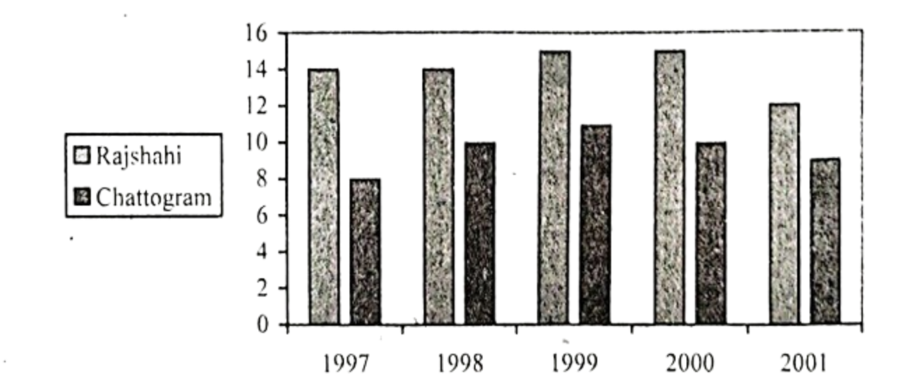
The chart below shows the minimum temperature (in Celsius) at Chattogram and Rajshahi in the years between 1997 and 2001. Describe the chart in 150 words. You should highlight and summarize the information given in the chart.
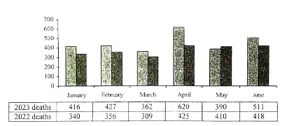
Look at the following graph. It shows the comparative number of death caused by road accidents in the first six months of the year 2022 and 2023. Now, describe the graph in your own words in 150 words. You are advised to highlight and summarize the information given in the graph.
Comparative number of deaths caused by road accidents in Bangladesh in the first six months of the year 2022-2023:
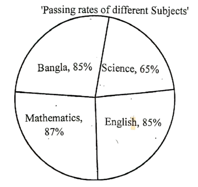
Look at the following pie-chart. It represents the passing rates of the students in different subjects of a school. Now, describe the chart in your own words.