11. Analyzing maps / graphs / charts
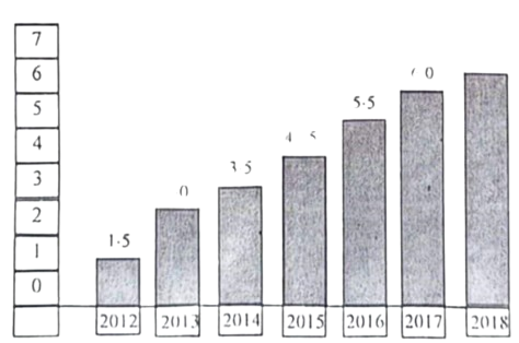
1. The graph shows "the internet users" from 2012 to 2018. Describe the graph in at least 80 words.
Ai এর মাধ্যমে
১০ লক্ষ+ প্রশ্ন ডাটাবেজ
প্র্যাকটিস এর মাধ্যমে নিজেকে তৈরি করে ফেলো
উত্তর দিবে তোমার বই থেকে ও তোমার মত করে।
সারা দেশের শিক্ষার্থীদের মধ্যে নিজের অবস্থান যাচাই
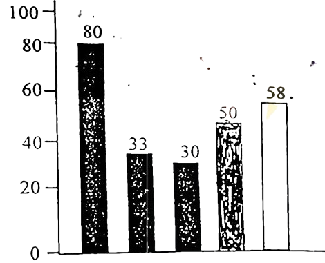
The graph below shows the importance and usage of English. Describe the graph in at least 80 words:
 (By serial)
Usage of English in information technology 80%
Usage of English as the 1st language 33%
Used in various organizations 30%
Used in other purposes 50%
Using English as the 2nd language 58%
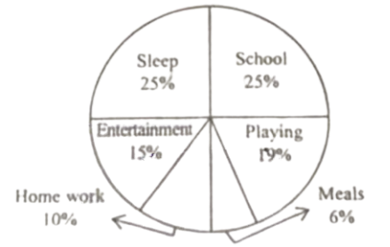
The pie chart below shows Rima's time spending on various activities. Describe the chart in at least 80 words.
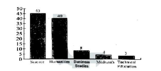
The graph below shows students from different academic areas who got themselves admitted into a public university last year. The left-aligned numbers show the percentages of students. You should analyse the information mentioning, the ratio of their achievements in at least 150 words.