11. Analyzing maps / graphs / charts
The pie chart below shows the percentage of the types of books in a college library. Write an interpretation on the given data.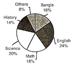
The percentage of the types of books in a college library
The pie chart shows the percentage of various types of books in a college library.
According to the data on the chart, of the total books are on English. Next comes the books on Science, which constitute of the total books of the library. Mathematical books, as the chart shows, comprises of the books of the library. Books on Bangla are while books on History are . The rest of the books are on other subjects. And these books constitute of the books of the library. Thus, it is clear that in order of numbers English books occupy the first position, books on science the second and books on Mathematics the third, books on Bangla and History the fourth and fifth position respectively. The category others occupies the last position in this respect.
To sum up, the numbers of various types of books depend on the students' aptitude (ঝোঁক) or liking.
Ai এর মাধ্যমে
১০ লক্ষ+ প্রশ্ন ডাটাবেজ
প্র্যাকটিস এর মাধ্যমে নিজেকে তৈরি করে ফেলো
উত্তর দিবে তোমার বই থেকে ও তোমার মত করে।
সারা দেশের শিক্ষার্থীদের মধ্যে নিজের অবস্থান যাচাই
The graph below shows the importance and usage of English. Describe the graph in at least 80 words:
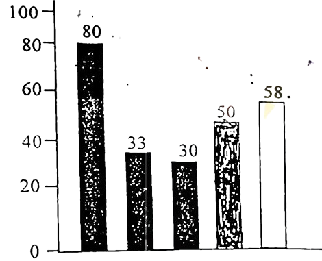 (By serial)
Usage of English in information technology 80%
Usage of English as the 1st language 33%
Used in various organizations 30%
Used in other purposes 50%
Using English as the 2nd language 58%
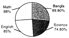
The pie chart shows the passing rates of different subjects of a school. Now, write a paragraph analyzing/describing the chart and give a suitable title to it.
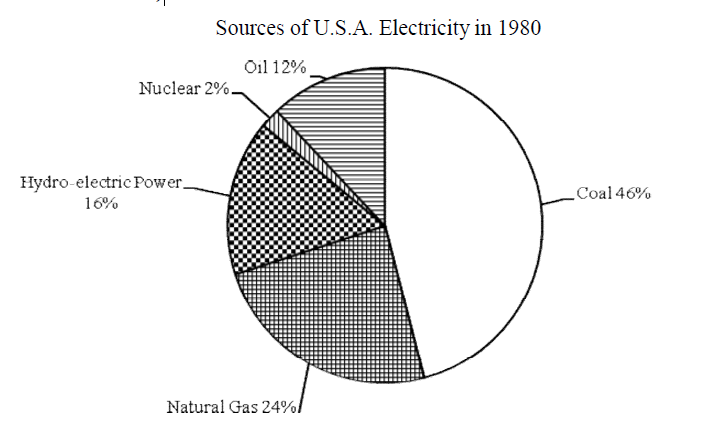
Look at the chart. It shows the sources of U.S.A. electricity in 1980. Now, analyze the chart focusing the main
aspects (At least in 150 words)
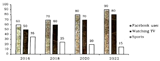
The graph below shows what percentage of time the college students in different areas of our country spend for pastime activities from 2016 to 2022 . Describe the graph in 150 words.