11. Analyzing maps / graphs / charts
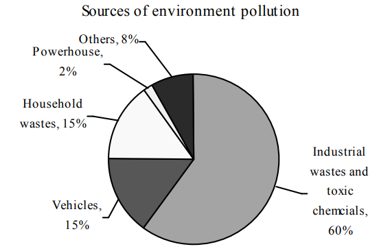
1. Look at the chart below. It shows the sources of environment pollution in a city. Now, analyse the chart in at least 80 words. You should highlight the information and the main features given in the chart:
Ai এর মাধ্যমে
১০ লক্ষ+ প্রশ্ন ডাটাবেজ
প্র্যাকটিস এর মাধ্যমে নিজেকে তৈরি করে ফেলো
উত্তর দিবে তোমার বই থেকে ও তোমার মত করে।
সারা দেশের শিক্ষার্থীদের মধ্যে নিজের অবস্থান যাচাই
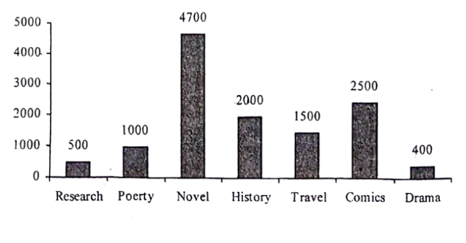
The graph below shows the selling rates of seven types of books in 'Ekushey Boi Mela-2023'. Describe the graph highlighting the information given in the bar chart:
The graph below shows the importance and usage of English. Describe the graph in at least 80 words:
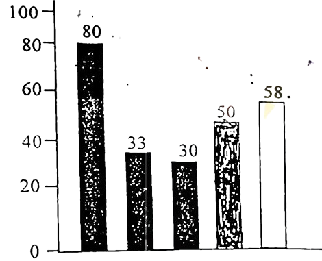 (By serial)
Usage of English in information technology 80%
Usage of English as the 1st language 33%
Used in various organizations 30%
Used in other purposes 50%
Using English as the 2nd language 58%
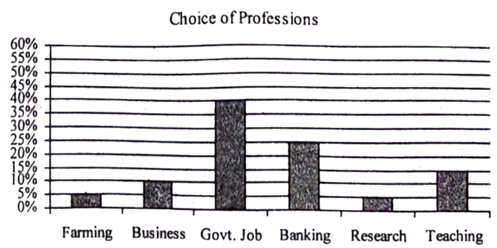
The graph chart shows the choice of profession by educated people in our country. Now, describe the chart highlighting important points:
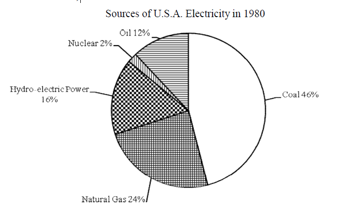
Look at the chart. It shows the sources of U.S.A. electricity in 1980. Now, analyze the chart focusing the main
aspects (At least in 150 words)
